
Simplifying Financial Administrative Complexity
Overview
I interned as a UX/UI Designer at Kynza, an early-stage Canadian fintech startup, during the summer of 2022.
My primary focus was on improving app usability. I collaborated with a cross-functional team that included the CEO, design lead, project manager, and a fellow intern. Together, we revamped user flows to ensure they aligned with the CEO's vision and user research results.
What is the Kynza app?

Kynza’s objective was to develop a platform that streamlines the administrative tasks associated with managing ROSCA (Rotating Savings and Credit Associations) groups.
This eliminates the need for tedious bookkeeping in peer-to-peer banking and lending scenarios. The ultimate aim was to enhance the safety, ease, and accessibility of saving money for Canadian communities.
My contribution
UX research UX design UX consultation UI design
The team
2 × UX/UI interns 1 × design lead 1 × project manager 1 × CEO
Tools used
Figma Miro
Year
2022

🔍Problem
Within ROSCA savings groups, members often grapple with difficulties in monitoring contributions and disbursements, leading to confusion and potential disputes. When I joined Kynza, they already had an MVP app in place to address this specific issue by offering a mobile tool for ROSCA management.
Goal: Revamp User Flow
My primary objective was to tackle the existing UX issues within the Kynza MVP app and redesign the initial user flow. This involved applying UX design principles to enhance usability. I concluded my internship with UX research and three iterations of the user flow.
*Kynza ceased operations shortly after expressing interest in extending my tenure at the end of the internship period. After my internship at Kynza, I dedicated my personal hours to create UI prototypes as a wrap up to this project. Note that UI prototypes weren't part of my deliverables at Kynza.
💡Outcome
To address usability issues, my design solution was refined using research insights.
It centred on streamlining group management, enabling clear and automated payment reminders, and simplifying the onboarding process for Kynza's digital ROSCA experience.
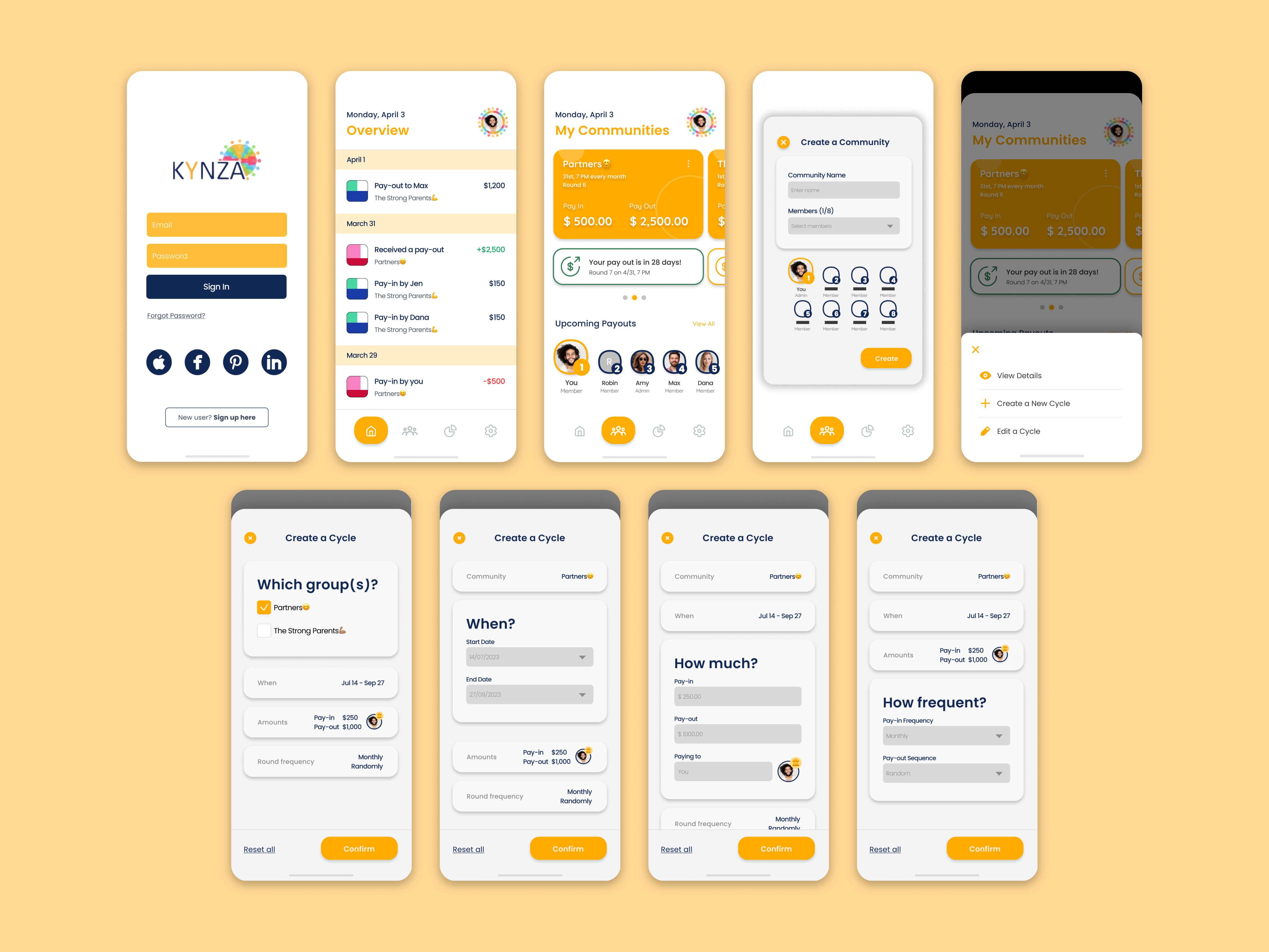
The following shows the key UIs of the redesign.
🧩My Process
1️⃣ We began with research to learn what the current digital ROSCA landscape looks like.
My design strategies above were shaped by insights gained from researching existing ROSCA practices, studying users’ potential preferences and motivations, and conducting an UX evaluation.
Below, I outline some of the research and evaluation methods I used.


2️⃣Refined with research insights, I delved into restructuring the Kynza app’s user flow.
My design solution was refined based on research insights, and it focused on the following key aspects. Design actions included significant restructuring of the visual hierarchy and breaking down crowded actions into more manageable steps.


3️⃣Dedicated personal hours to realize the new user flow through new UIs.
As previously stated, Kynza stopped its operations shortly after expressing interest in extending my internship. Following my internship at Kynza, I devoted my personal time to develop more usable interfaces and prototypes as a conclusion to this project.
The below displays some simple wireframing using Miro.

The following outlines my key thought processes as I solve usability issues in the original MVP, guided by the three design aspects.
The left shows the UIs of the MVP, while the right shows the revamped UIs I designed in Figma.

